Difference between revisions of "Custom Fields"
| Line 31: | Line 31: | ||
|- | |- | ||
|style="width: 25%"|[[File:Text-field.png|250px|center]] | |style="width: 25%"|[[File:Text-field.png|250px|center]] | ||
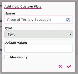
|style="width: 30%"|Text | |style="width: 30%"|Using a Text field allows a reply containing alphanumeric characters and symbols. | ||
|style="width: 25%"|[[File:Number-field.png|250px|center]] | |style="width: 25%"|[[File:Number-field.png|250px|center]] | ||
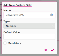
|style="width: 30%"|Number | |style="width: 30%"|A Number field prompts a reply in a numerical value only. | ||
|- | |- | ||
!colspan="2"| Date | !colspan="2"| Date | ||
| Line 39: | Line 39: | ||
|- | |- | ||
|[[File:Date-field.png|250px|center]] | |[[File:Date-field.png|250px|center]] | ||
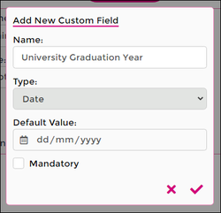
|Date | |The Date default value will prompt for a single date in DD/MM/YYYY format. | ||
|[[File:Time-field.png|250px|center]] | |[[File:Time-field.png|250px|center]] | ||
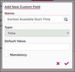
| | |Allows a single time value to be entered. | ||
|- | |- | ||
!colspan="2"| DateTime | !colspan="2"| DateTime | ||
| Line 47: | Line 47: | ||
|- | |- | ||
|[[File:Datetime-field.png|250px|center]] | |[[File:Datetime-field.png|250px|center]] | ||
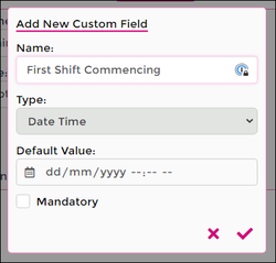
|Date/Time | |Date/Time field allows entry for a specific date and time | ||
|[[File:Option-field.png|325px|center]] | |[[File:Option-field.png|325px|center]] | ||
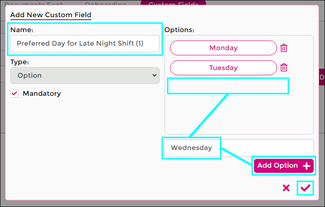
|Option | |Use Option to enable a single selection from a list of pre-set values. | ||
|- | |- | ||
!colspan="2"| MultiOption | !colspan="2"| MultiOption | ||
| Line 55: | Line 55: | ||
|- | |- | ||
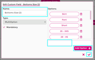
|[[File:Multioption-field.png|325px|center]] | |[[File:Multioption-field.png|325px|center]] | ||
|MultiOption | |Use MultiOption to enable a multiple selections from a list of pre-set values. | ||
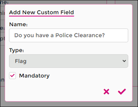
|[[File:Flag-field.png|275px|center]] | |[[File:Flag-field.png|275px|center]] | ||
|Flag | |Flag field is similar to a YES/NO response. Simply tick a box for YES, leave unticked for NO. | ||
|- | |- | ||
|} | |} | ||
Revision as of 05:18, 14 July 2023
Using the Custom Fields section of Wageloch HR allows you to add extra fields into the Onboarding Workflow or into the Additional Information section within a staff card. This could be simple information like "Has the staff member completed orientation?" and a tick to say "yes", or even the ability to list skill sets and tick multiple options.
This article will cover each of the Custom Field types, their setup and potential uses.
Creating Custom Fields
Using custom fields within Wageloch HR unlocks a new set of information that can be entered by staff during their Onboarding process or added manually into the staff card via Additional Information.
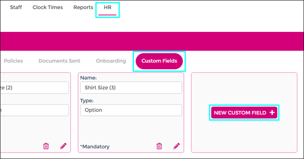
- Click HR from the top menu
- Select Custom Fields from the HR categories
- Click New Custom Field+
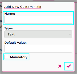
- Give the Custom Field a name
- Select the Custom Field Type (more information below)
- Select if the information is mandatory to fill out or not
- Click the tick icon to add/save.
Custom Field Types
Creating the fields themselves is easy enough, but working out the best option for what information you're seeking is a little more tricky.
Lets look at the different options for the field types and examples of what they could be used for.
Click on any of the images to see a larger screen shot.
| Text | Number | ||
|---|---|---|---|
| Using a Text field allows a reply containing alphanumeric characters and symbols. | A Number field prompts a reply in a numerical value only. | ||
| Date | Time | ||
| The Date default value will prompt for a single date in DD/MM/YYYY format. | Allows a single time value to be entered. | ||
| DateTime | Option | ||
| Date/Time field allows entry for a specific date and time | Use Option to enable a single selection from a list of pre-set values. | ||
| MultiOption | Flag | ||
| Use MultiOption to enable a multiple selections from a list of pre-set values. | Flag field is similar to a YES/NO response. Simply tick a box for YES, leave unticked for NO. | ||
